As with many people around the world in 2020, we started thinking about what remodeling projects we wanted to undertake at our house. A while ago we noticed a slight leak in the roof area of our sunroom. We think that room used to be an exterior patio that prior owners enclosed, so its roof wasn't part of the main roof and clearly wasn't covered appropriately. We knew that had to be dealt with, so we got a quote on removing all the old windows, replacing the interior sheetrock, putting on an adequate roof, and installing two sets of sliding glass doors. That turned out to be more expensive than we thought it would be, which got us thinking about just how much remodeling we wanted to undertake this year. If we're going to spend X amount of money on the sunroom, why not just knock everything out at once with one company who can accomplish multiple items on our to-do list? Rarely am I thankful for a quote that comes in higher than expected, but in this case, it resulted in some amazing transformations that might not have happened otherwise! I'll start with the sunroom, since I already mentioned it.
Here's the before:
And here's the after:
With the shutters on the windows, we never enjoyed the natural light or unobstructed views of the backyard. Now, we have easier access to our entertaining area and better views from the interior.
Next up is our upstairs guest bathroom. We are lucky enough to have enough room downstairs for the whole family to sleep, so our upstairs has always been available for guests. There are two bedrooms and a full bathroom up there. When previous owners designed that bathroom, they really didn't utilize the space well. They took up too much of the bathroom with vanities and shoved a shower in a corner where the roof slopes. Our construction crew chief, Amelia, came up with a much better design for that bathroom and the remodeling company gave us examples of what types of finishes we should aim for. Here are some before pics (brace yourself):
And here are the after pics!!
We went with gray cabinets and white quartz counters (to match our kitchen and laundry, which you'll see shortly). The toilet was relocated to the back where the roof curves, which makes way more sense than having a shower there. That space was widened by removing part of the wall.
The shower was relocated and expanded and updated with a modern design. I love the floor/wall and accent tile that we chose.
Recessed lighting was added throughout, along with a super cool rain shower head and a detachable extra shower head.
We used the accent tile in the storage niche too.
My jaw still drops when I walk in that bathroom, mainly because I know what it looked like before. The configuration now makes so much more sense and I think guests will finally feel taken care of!
In the past, I always complained about our utility area because it didn't have a clear purpose and seemed like a hodge podge space that didn't really accomplish any one thing fully. It served as our laundry room, pantry space, water heater closet, and powder bathroom. There were no cabinets for my laundry supplies and no good space for folding or laying clothes out to dry. The powder room felt tiny, and the pantries seemed too shallow. The cabinetry was old and outdated. Luckily, we were able to remedy all of my complaints! Here are some before pics of the utility:
And here's how we fixed it!
We added cabinets above the washer and dryer so all my laundry supplies could be out of sight. We also flipped the way the bathroom door opens. It used to open in, which crowded your space as you entered. Now it opens out, so the bathroom feels bigger.
We completely removed all the outdated pantry cabinets to the right of the entrance and replaced them with a true laundry station. Now there is a hanging rod, extra upper cabinets, a quartz counter for folding clothes, a lower cabinet for our dog food, and a space for laundry bins. It's an actual laundry room!
We got rid of the huge door and replaced it with a barn door. We rarely closed that door anyway, but now when we do, at least it will be more stylish.
The tall cabinetry is actually hiding our water heater! Not sure I've ever seen a fancier setup for one of those. The furthest cabinet is an overflow pantry for whatever doesn't fit in our kitchen. There's also additional space to the left of the cabinet where we keep our stand-up items, like a step ladder and brooms, etc. I feel so much better about this space because it has more purpose (and clearly a more modern design) now.
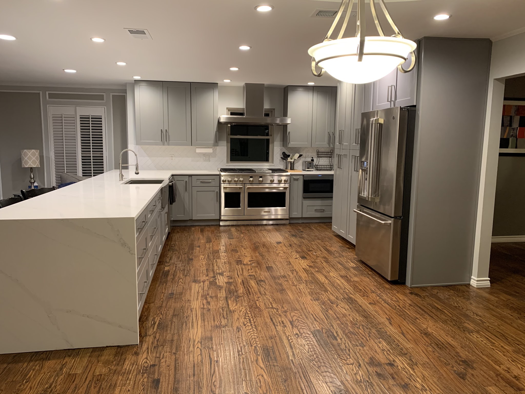
I saved the best project for last! We've been wanting a new kitchen since essentially the day we bought the house, but we kept putting it off in favor of more necessary work (foundation, plumbing, windows, flooring, etc). Finally, the time was right! Our kitchen was a U shape, that sided to the living room. Meezy always talked about taking the wall down between the kitchen and living, but I worried about the loss of cabinet space. The cabinets had been updated in probably the last 20 years, but they didn't go all the way to the ceiling because of the fur-down. The counters were a shade of blue and were fake stone, the backsplash was boring, our ovens and cooktop were surrounded by a brick monstrosity that was a waste of space, and we didn't feel connected to guests since the kitchen was closed off. Take a look at the before pics:
Behold, our masterpiece!
Bye, bye wall! Now the kitchen opens up to the living room.
We opted for a huge stainless steel farmhouse sink that came with drop-in attachments like a strainer, cutting board, and drying rack. The faucet has a blue LED light that illuminates when it's on, and the light turns to red when the water gets hot.
We carried the gorgeous white quartz counters into a waterfall edge to give it a finished look. I love the wide soft-close drawers in this section of the kitchen.
We had the counter overhang into the living room so we could add bar stools.
I thought I'd be in trouble on food storage once I lost the pantries in the utility room, but these new cabinets utilize their space so much better than the old ones. Not only are they taller, but they are deeper and include drawers, so you can actually store items in the back and still get to them easily. The drawers and cabinet doors are all soft-close.

This range is essentially what I built my kitchen around! I've been waiting for the day when I could call this my own. After shopping various high-end brands, I realized that you were paying for name and not necessarily features. Don't get me wrong, this guy wasn't cheap, but it ended up being a better value for the money to go with GE Monogram instead of Viking, Wolf, Thermador, etc. It's got 6 burners plus a griddle, along with a full-size oven and an additional smaller oven. We put an island vent hood above it because we wanted as low a profile as possible. (Not super easy to do when you need 48" of vent). Hard to tell in the pic, but we went with a white subway tile in a herringbone design for the backsplash.
The best microwave option for our kitchen design was a built-in drawer microwave, so we went with a low profile Sharp with wifi capabilities. You can wave your hand in front of it to open it and operate it from your phone.
Lastly, we knew the niche on the other side of the kitchen needed some sprucing up, so we removed the brick surround and flattened the wall, changed the counter to match our kitchen counter, and added the same backsplash to match the kitchen. Eventually we may add shelves or a wine rack here.
Can you believe the changes? I feel like I'm in a totally different house now. The project took 5 weeks from start to finish. We are extremely pleased with the results and happy to share more info about our contractor, appliance supplier, finishes, costs, etc. Feel free to ask!


No comments:
Post a Comment